
DJ YASHO
Branding
Logos
Merch
Logo design and conceptual branding of an international touring electronic music performer
Assignment
Create a name and logo for an internationally touring DJ and musician
Inspiration
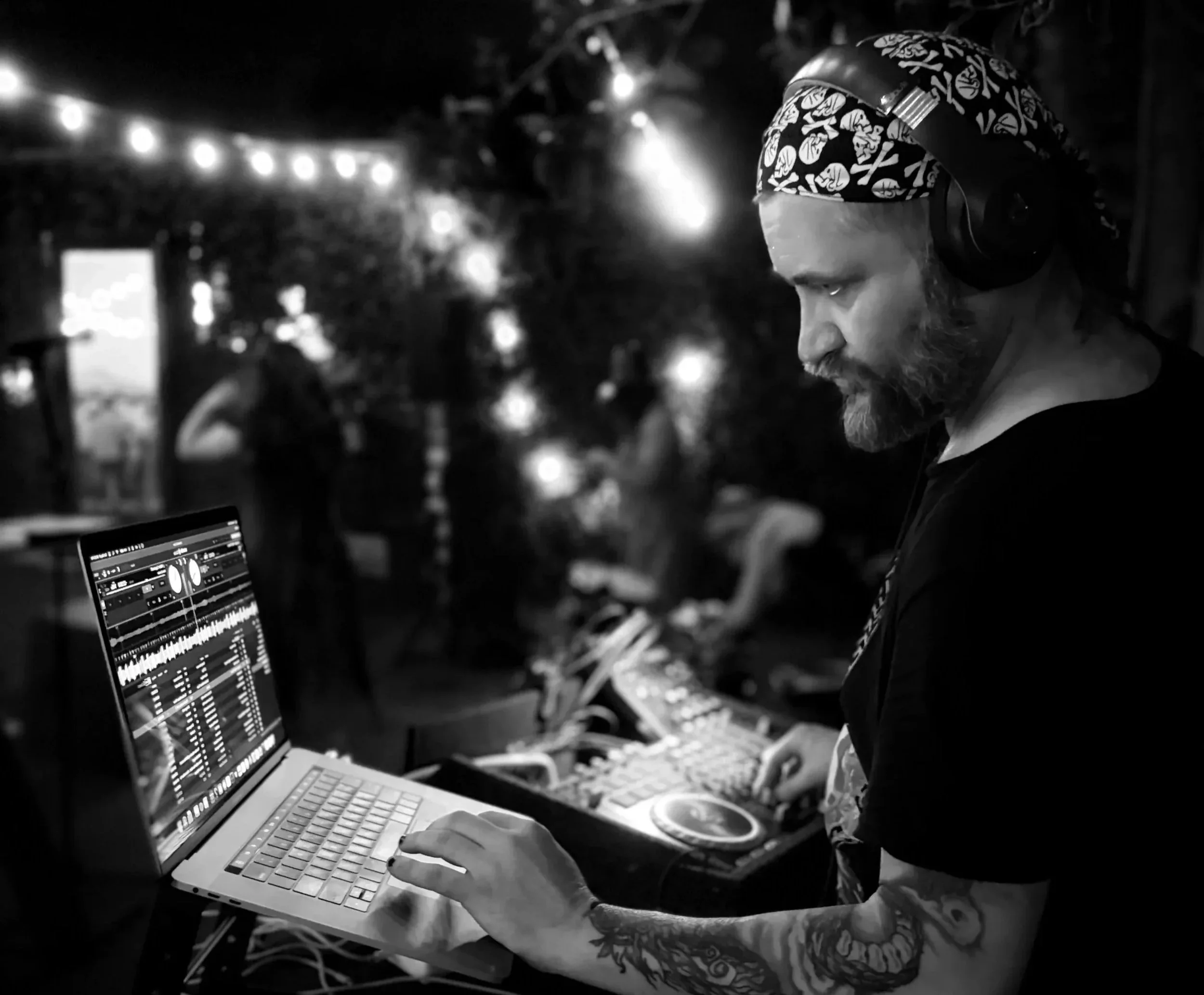
The client’s personal style as well as the type of music he would be playing (mostly 90s house and industrial). For the name, we researched current trends in the EDM world and looked for conflicts with the names the client provided. The logo was inspired by 90s era techno and industrial fonts and logos and suggestions from the client (see below).
Approach
The client already had a few names in mind which he asked me to search for possible conflicts. For original names, we did a detailed AI search to find names which would reflect his style of music while also feeling unique and modern.
For the logo ideas, we kept things edgy and bold. While the earlier designs incorporate some of the client’s visual touchstones (skulls, vinyl records), we eventually settled on something completely different. The final design sits firmly in the 90s techo-industrial world while also using a striking font and colors which will pop on a sticker or as a favicon (both client requests)
Result
We ultimately settled on the most authentic choice for the DJ name, which is a play on the client’s real name. And the client praised the logo’s uniqueness and suitability. The client has been touring in Europe using this name and logo! Check back for updates!
DJ SLICK DEXIC
DJ LIL PIL
SIKDEXSIK
SLIKDEXSIK
DEKSIK
DJ SLIKDEXIK
DEXIK
THOUGHT COLLAPSE
DECKSICK
DJ META ANALOG
METAANALOG
NEURAL RUIN
MISREAD
DJ REWORD
The client originally wanted to lean into his own struggles with dyslexia as inspiration for the name. However, we felt the variations of “DJ Slick Dexic” were too difficult to say and read on a show flyer or on social media. Here are some of the other names we brainstormed together.
NEUROGROOVE
DJ DIVERGE
DJ DIVERGENT
THOUGHT DECAY
NEUROGROOVE
SCAR PATTERN
DJ YASHO
The original name and logo we devised. Not currently being used and authentic to the client’s brand. Unfortunately it did not resonate with the client.
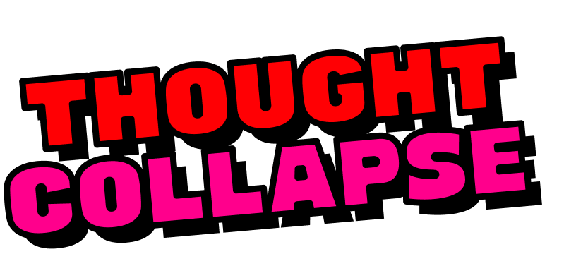
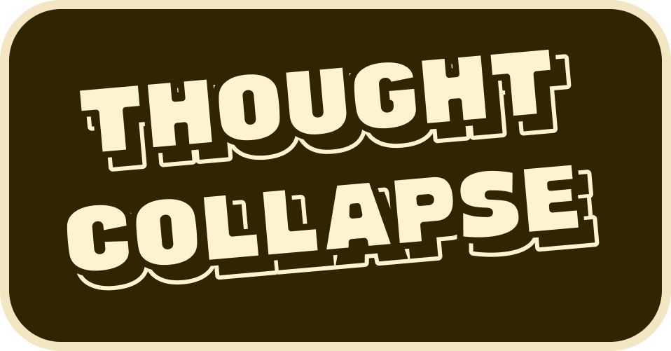
Original designs with client provided name. The client liked the general direction of these, but requested changes.
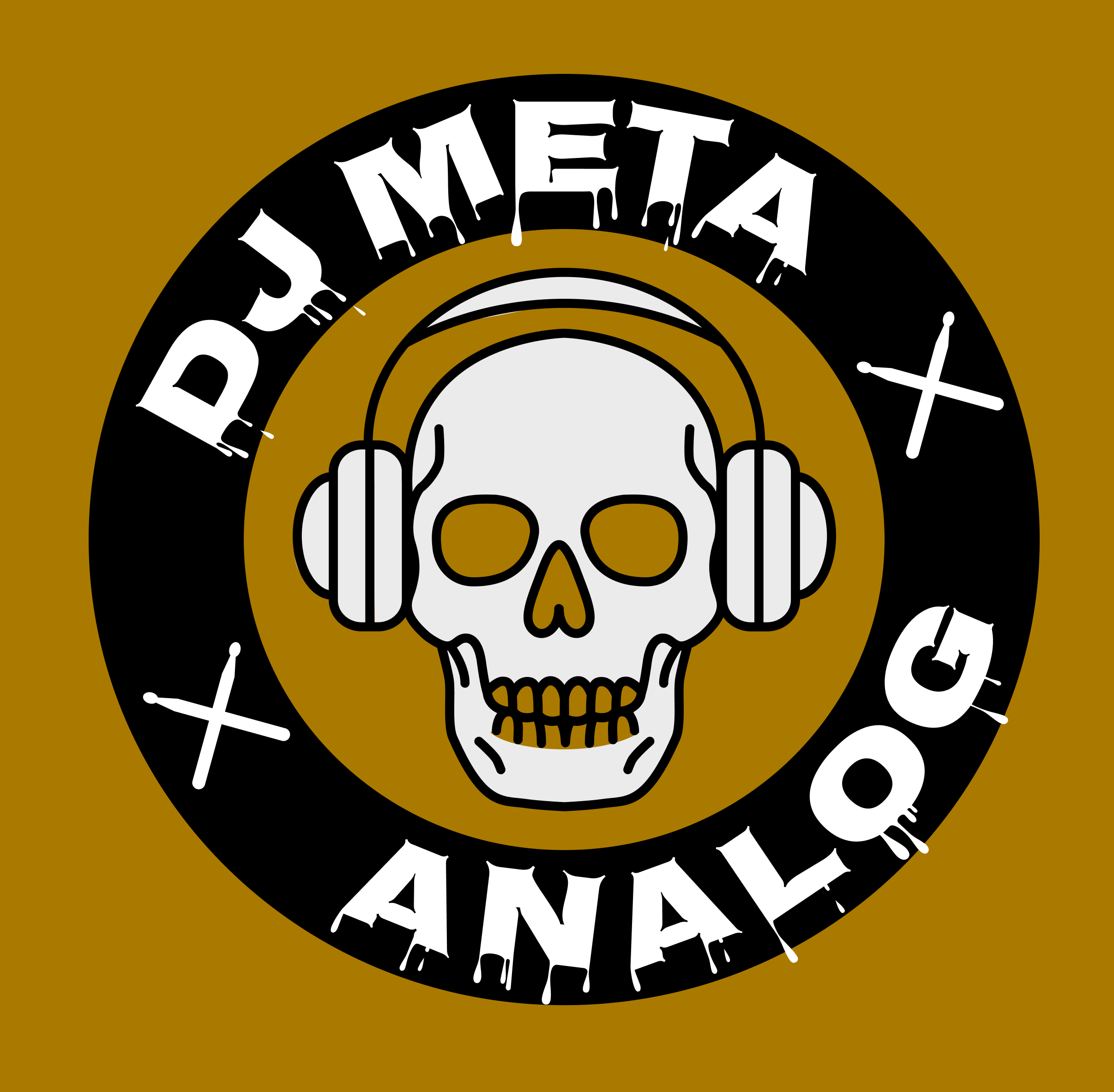
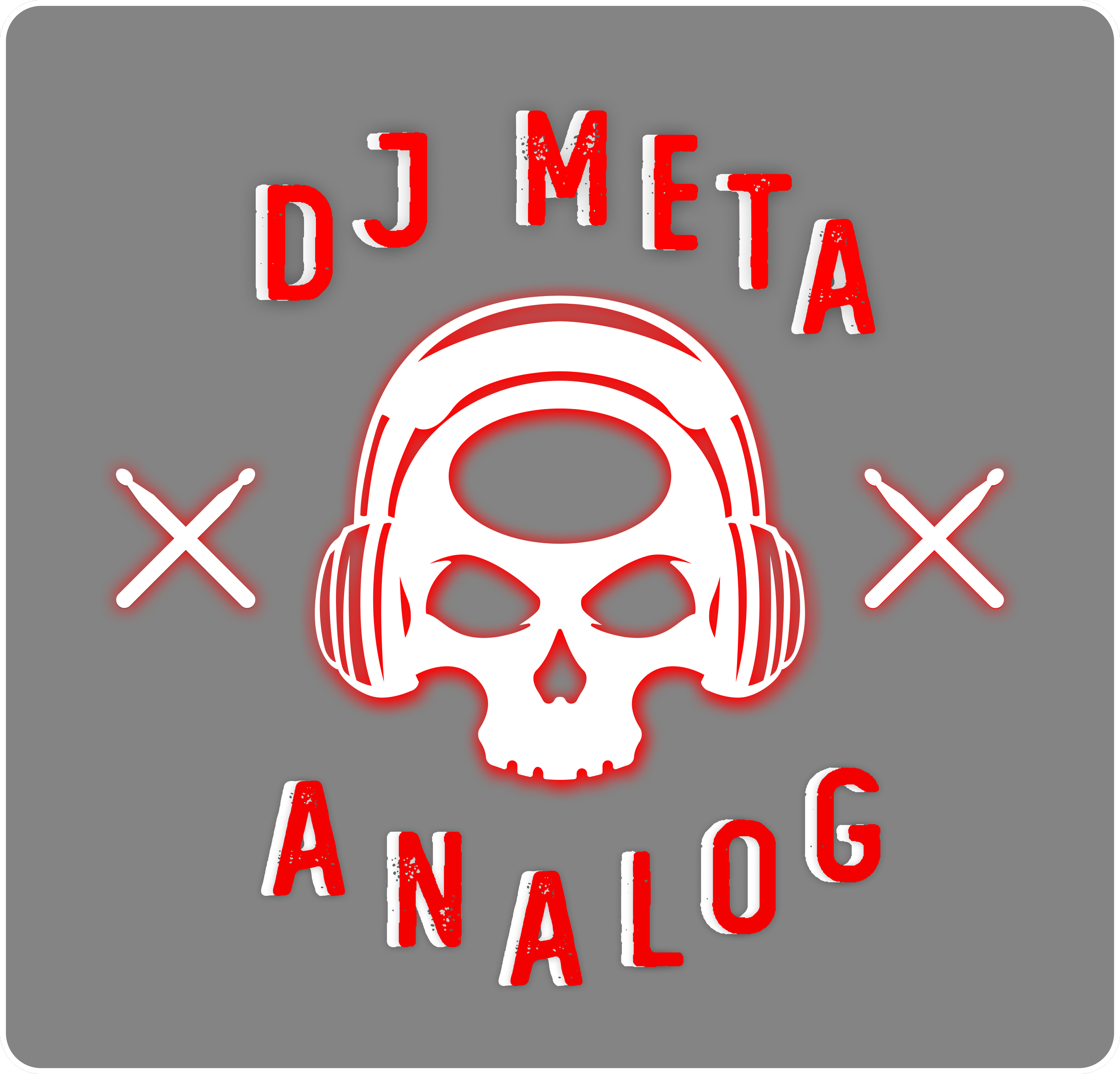
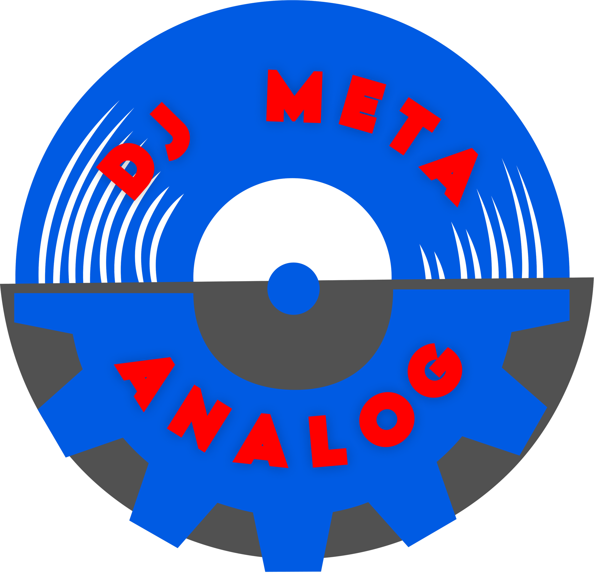
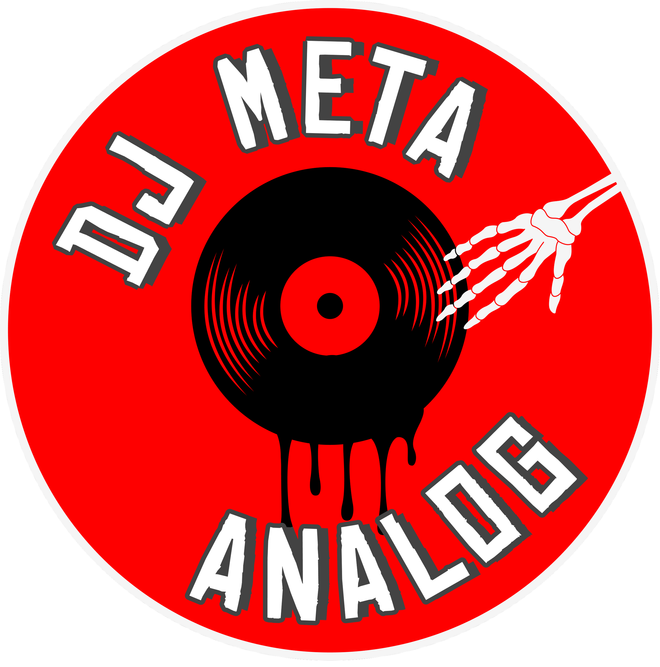
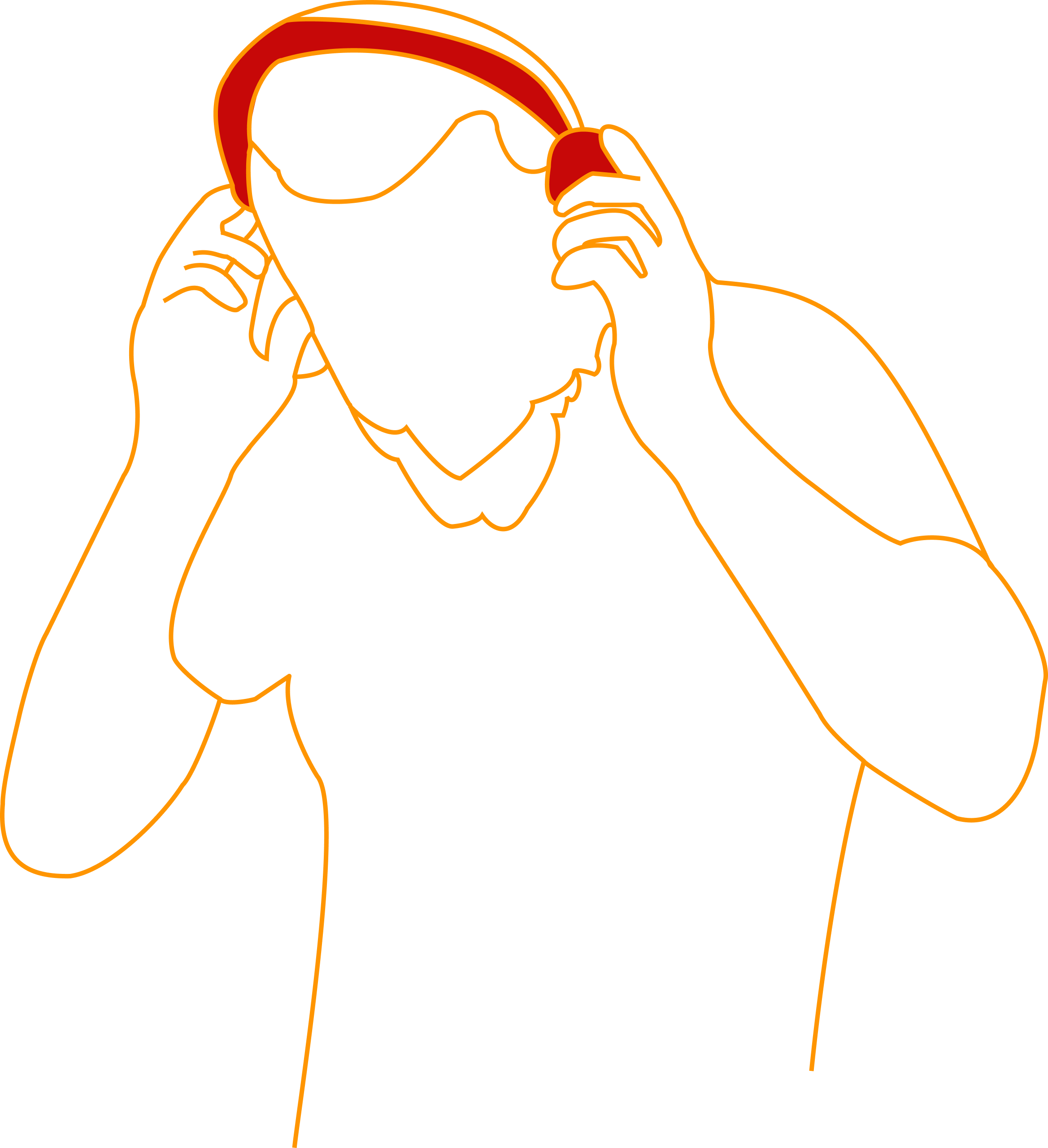
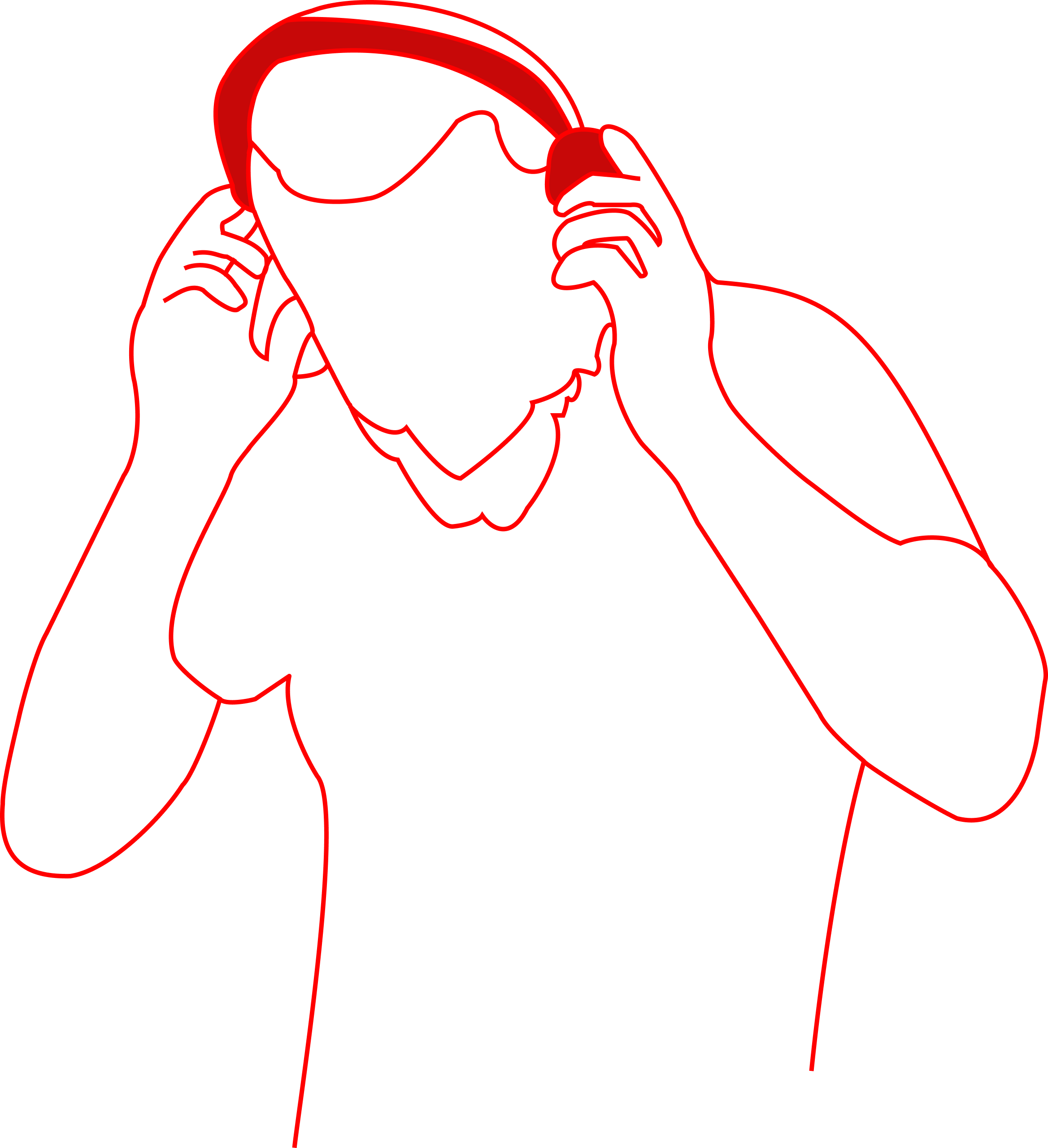
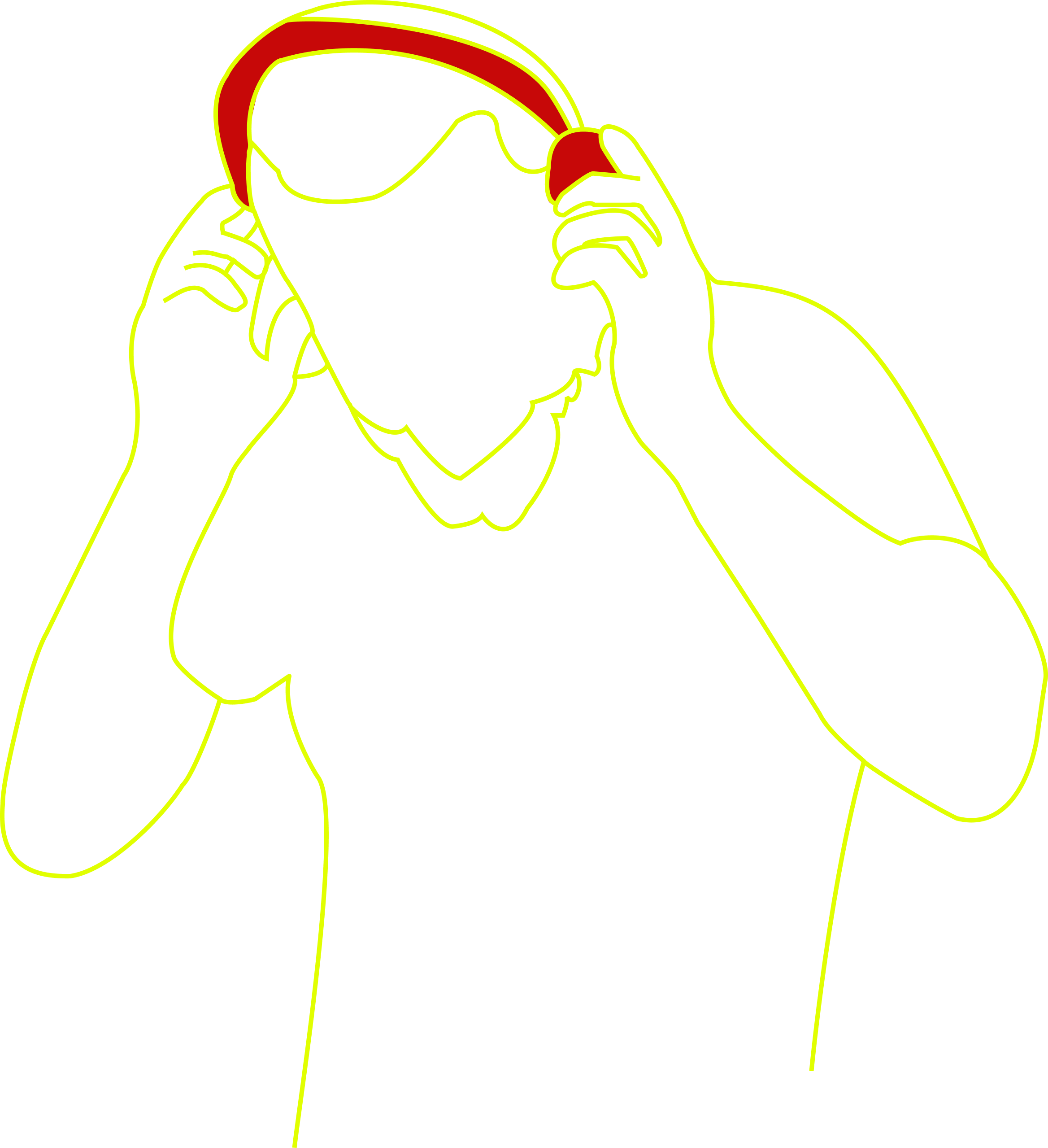
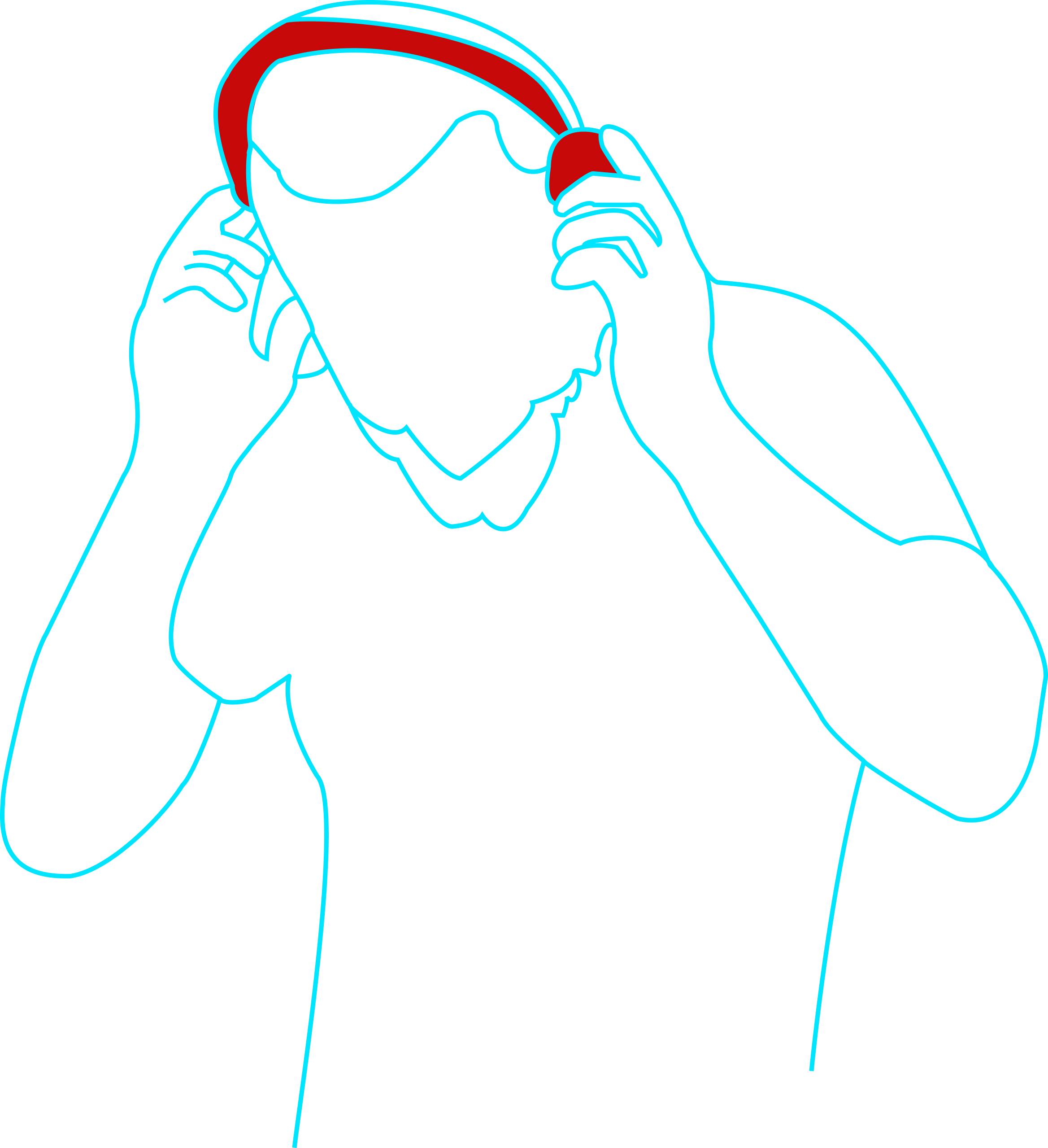
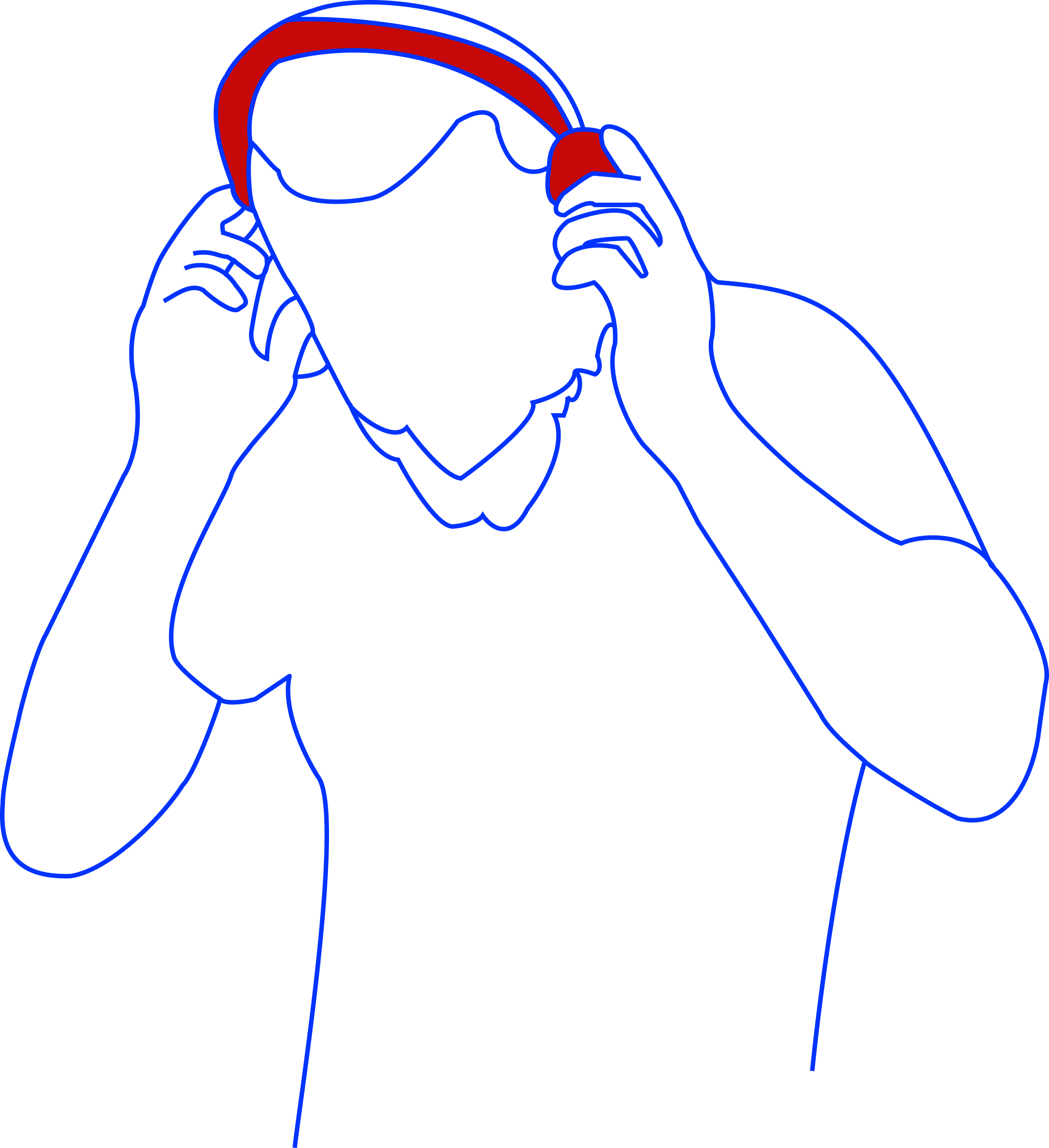
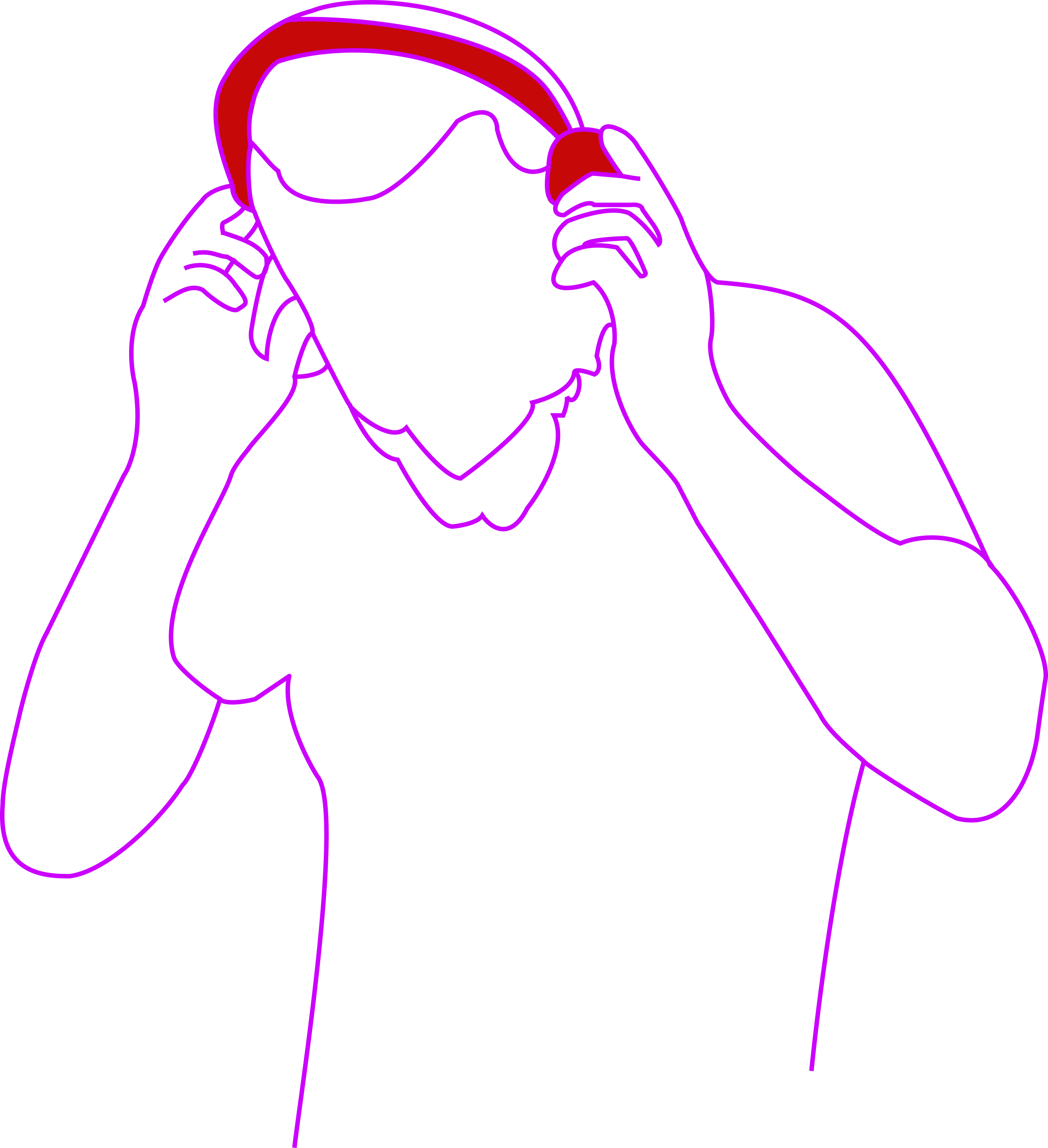
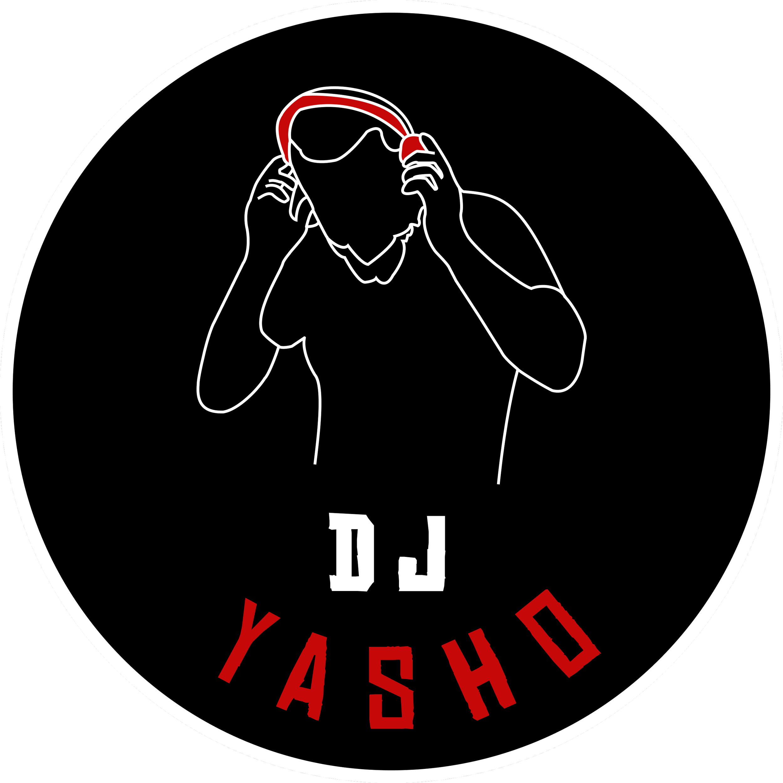
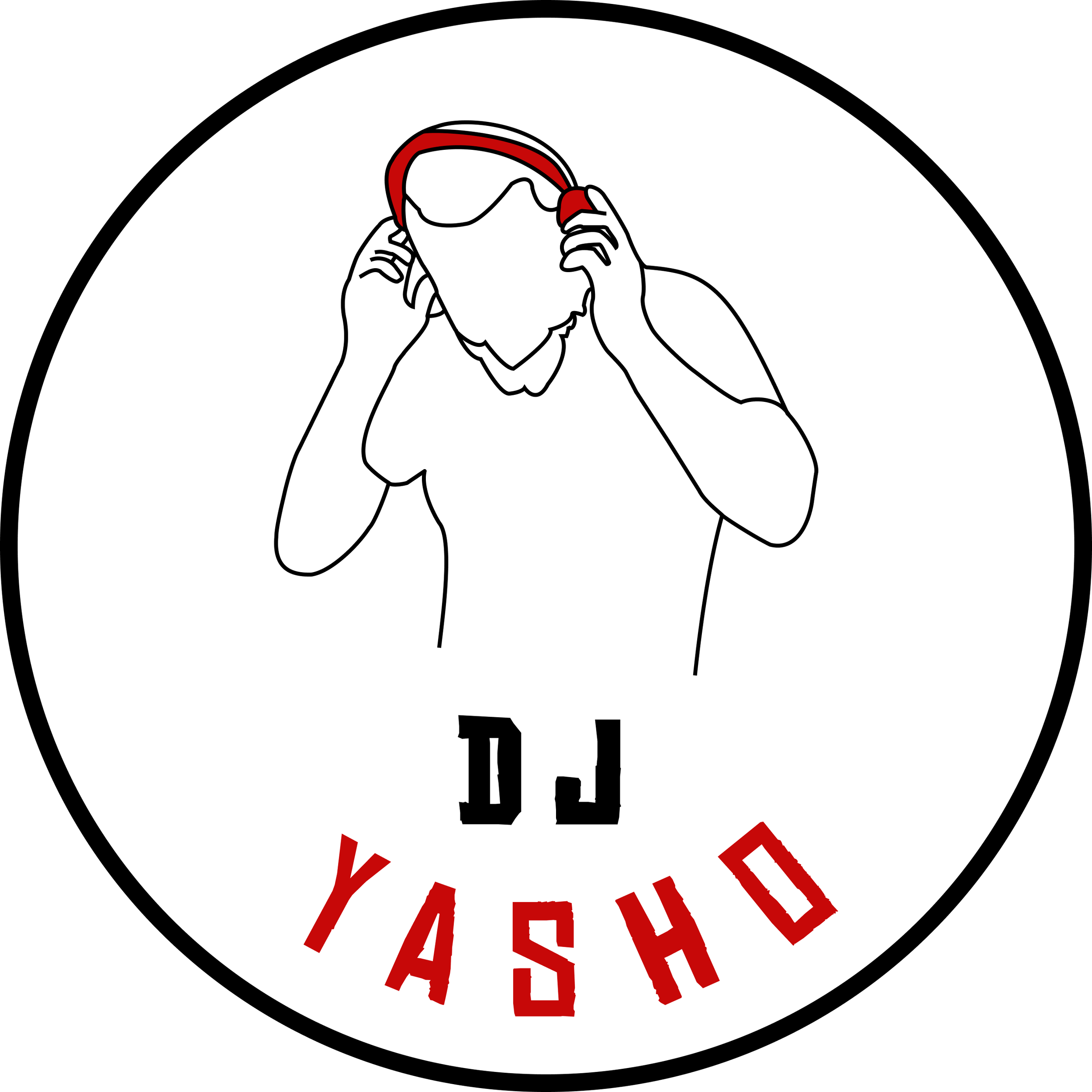
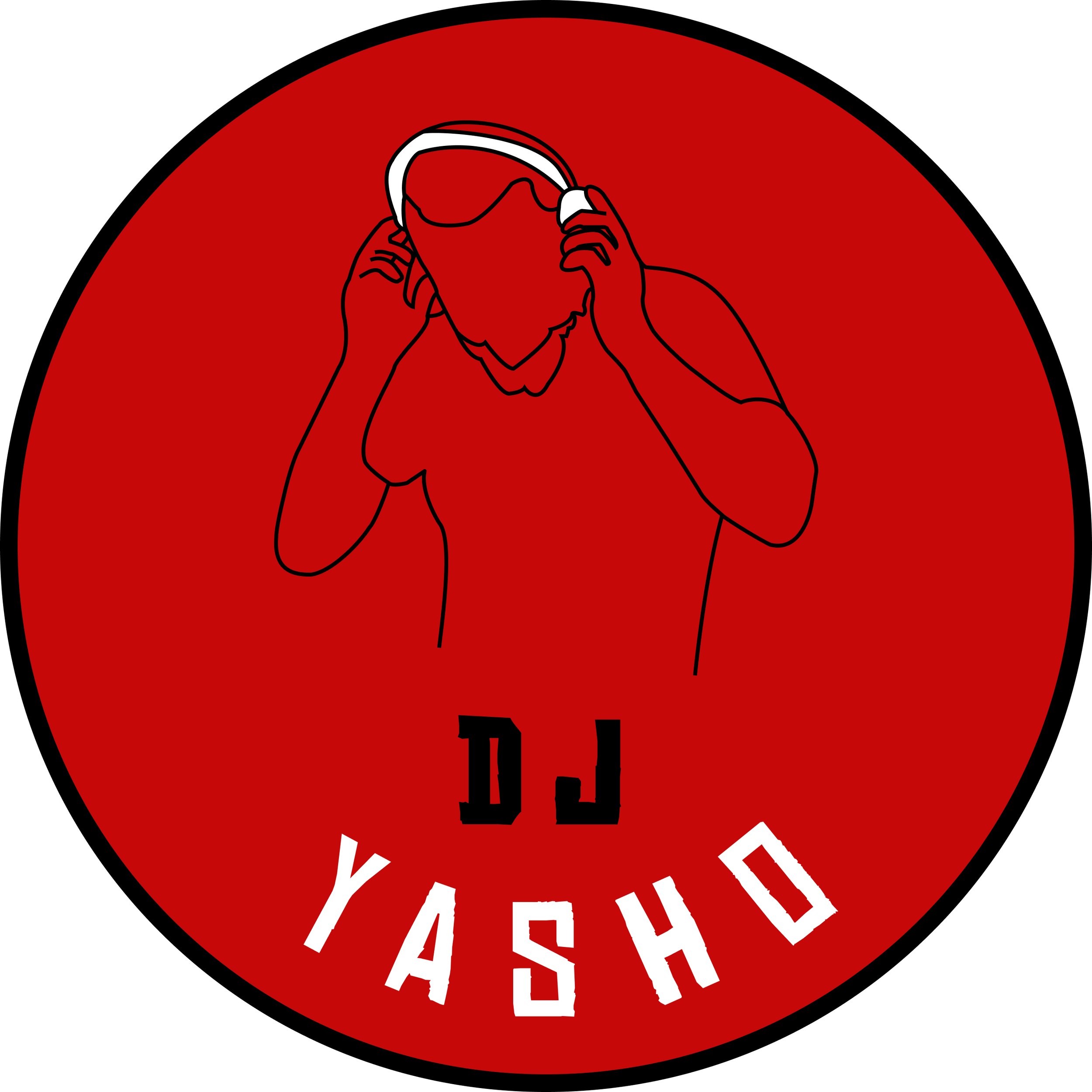
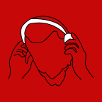
While all of these designs had upsides, deep down we knew we needed more. Before our first client meeting showing these designs, we decided to create a truly authentic image of the client mid- performance, based on a photo on his website. It turned out to be his overwhelming favorite!
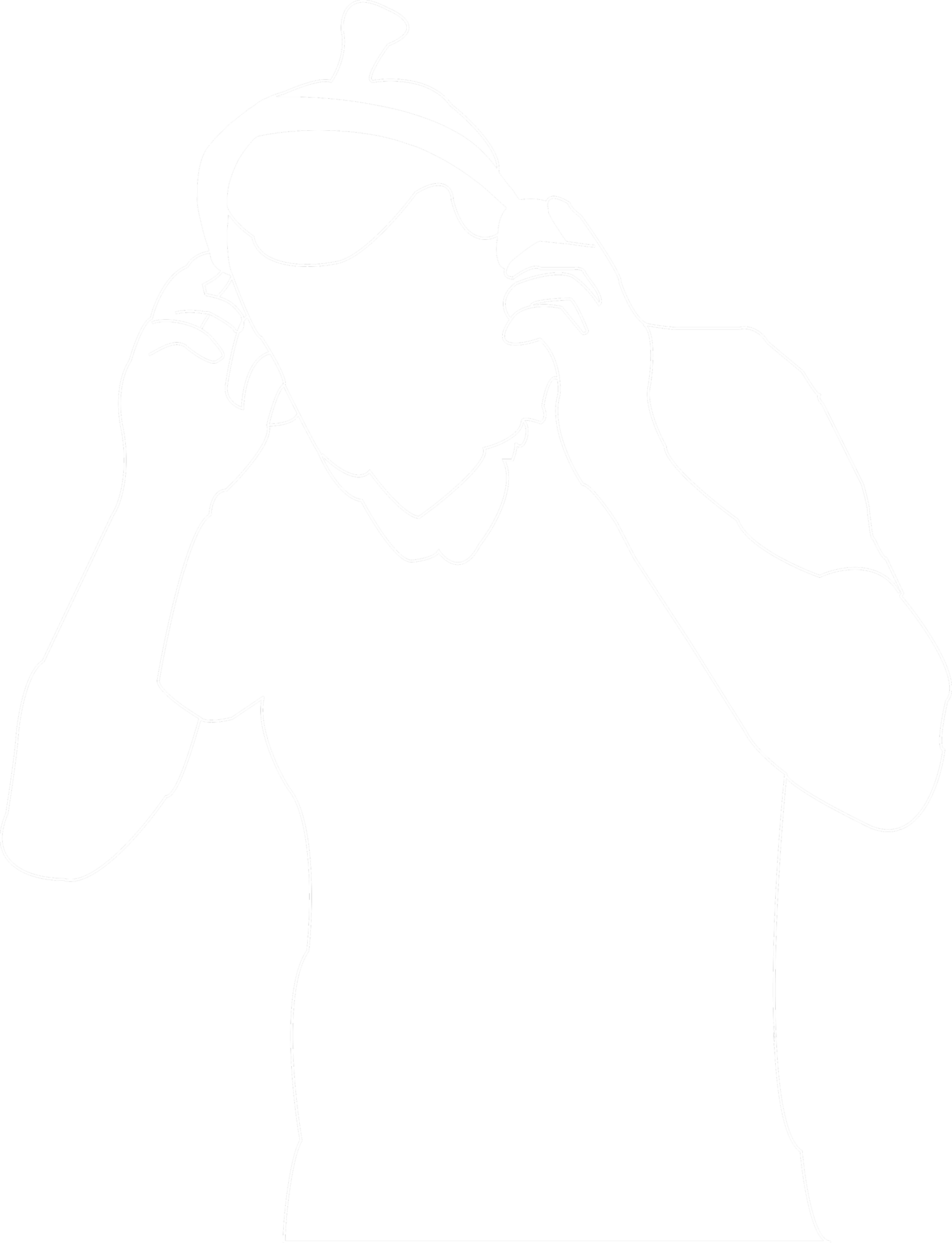
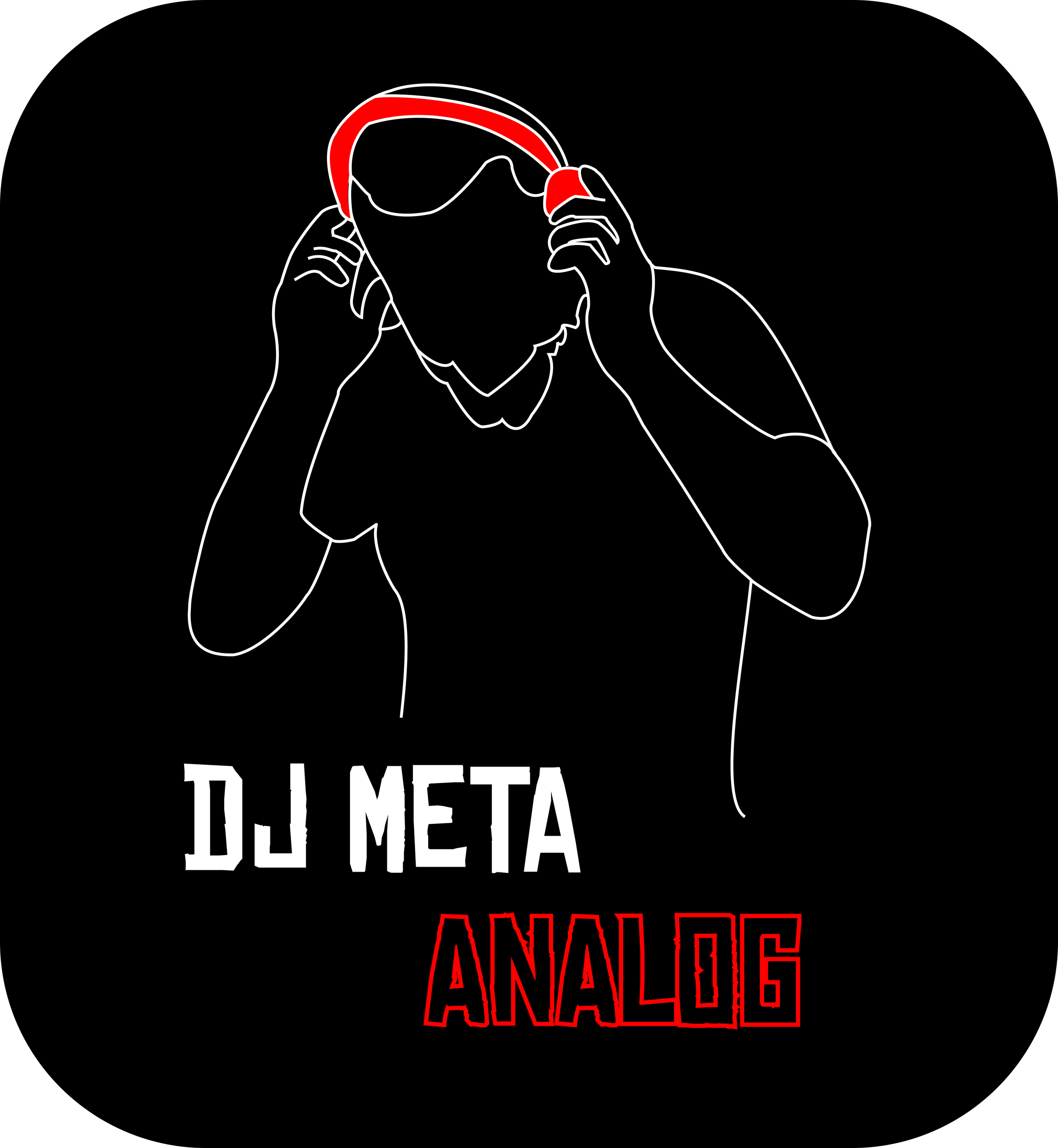
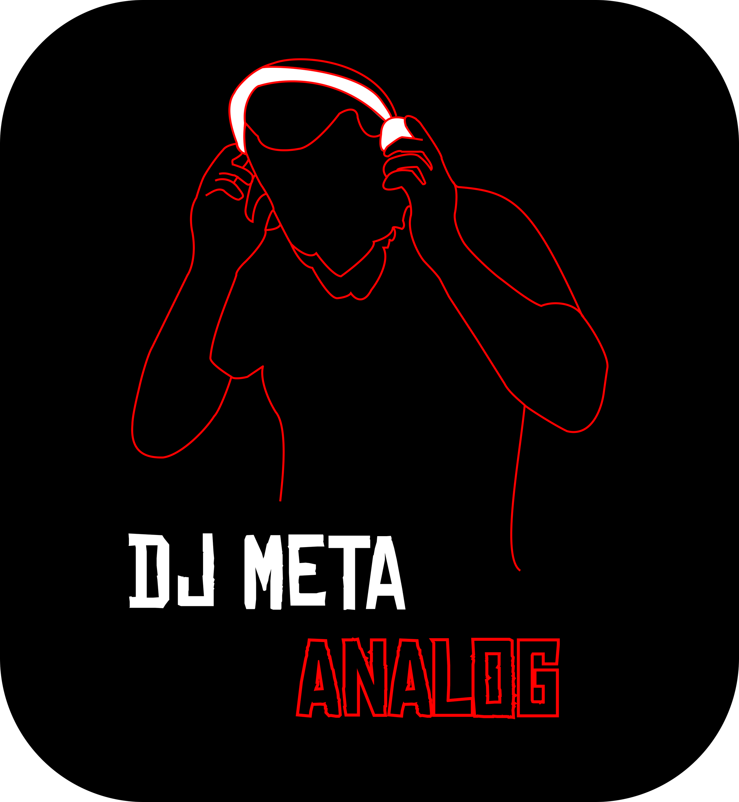
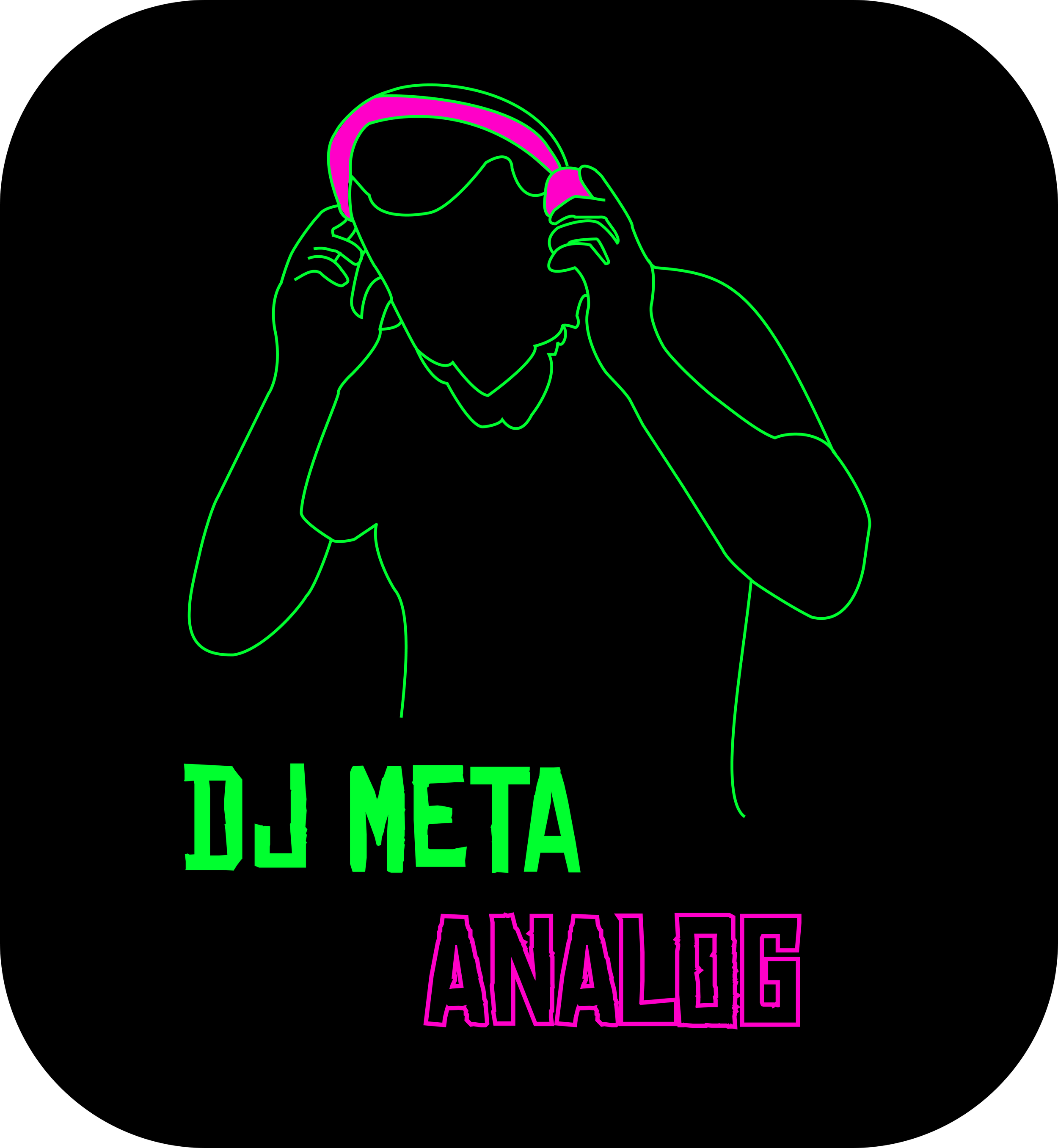
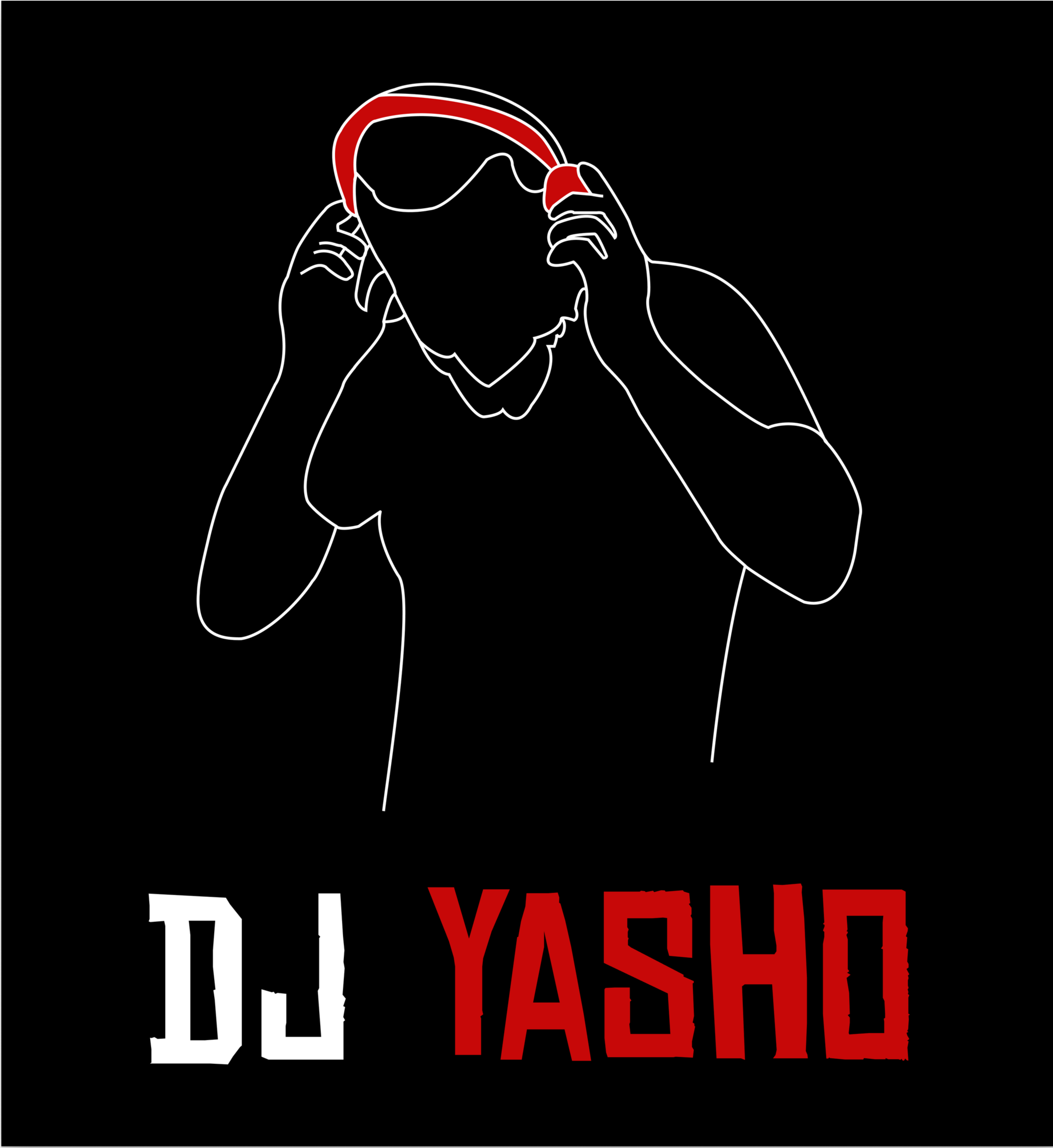
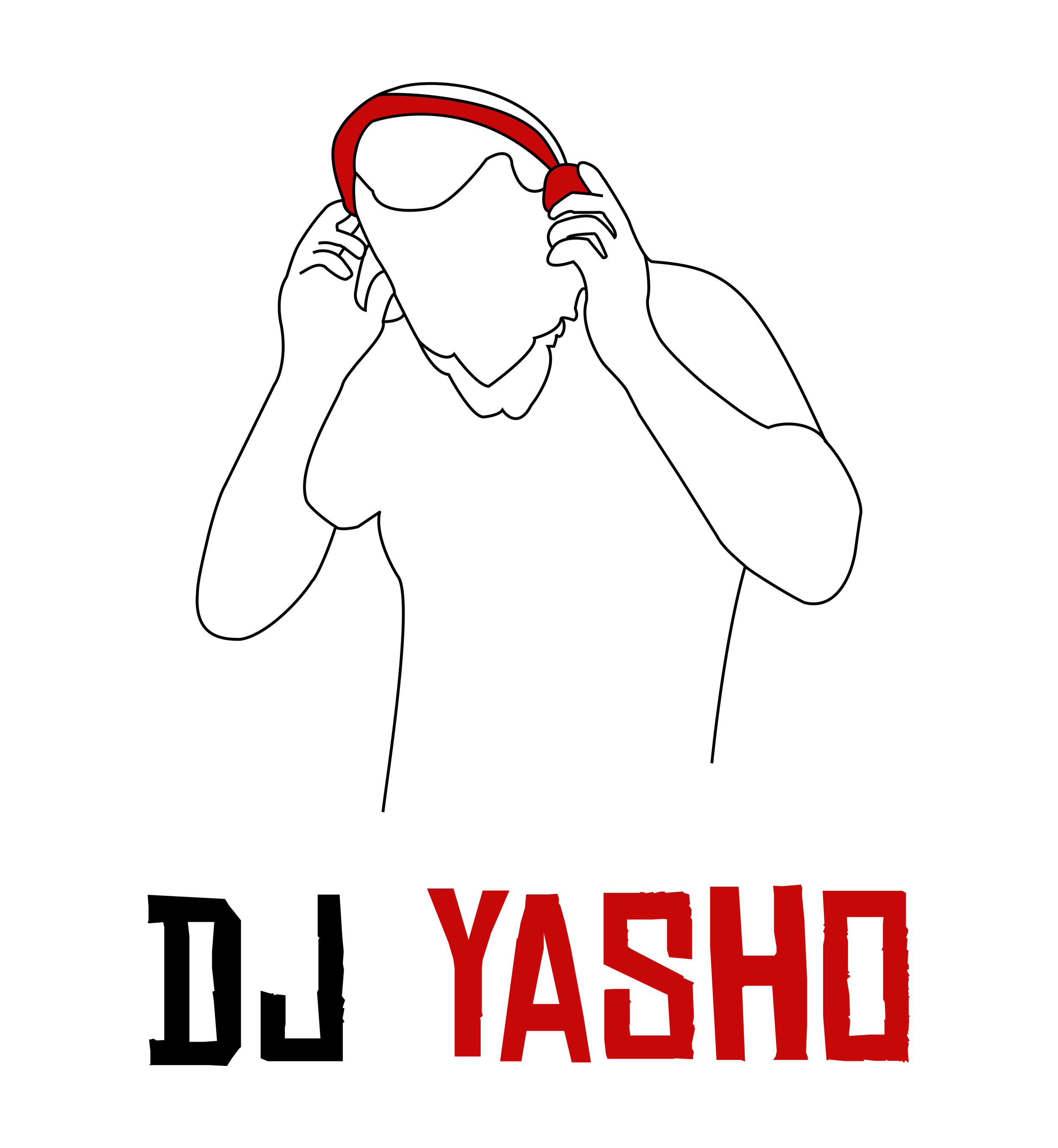
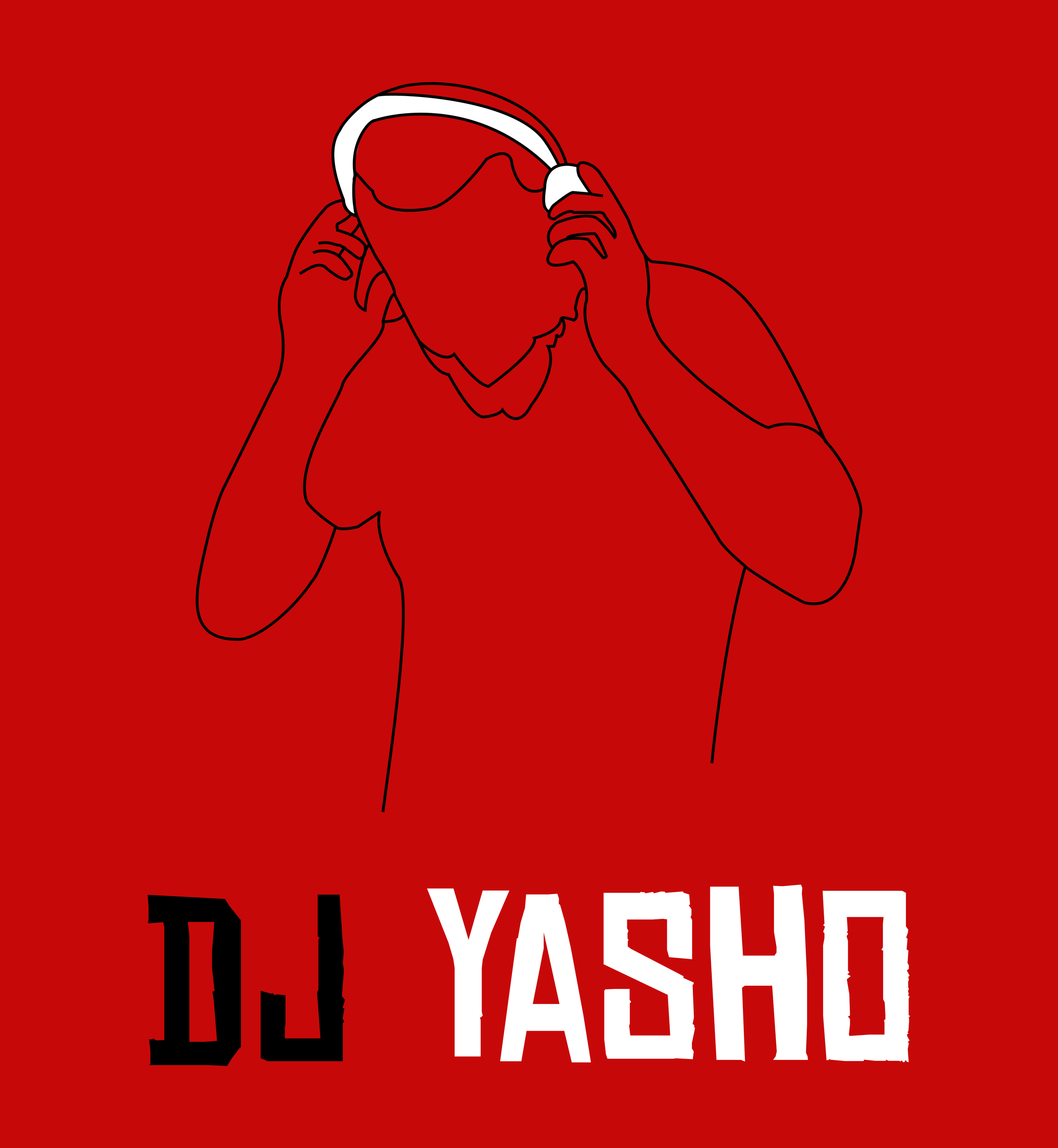
We advised the client that his chosen name “DJ Meta Analog” might conflict with the name of the Facebook and Instagram umbrella company Meta. He eventually agreed and settled on a variation of his own nickname, DJ YASHO. This name, we felt, was authentic to the client while also being unique enough to stand out among a crowded field of performers. Here are the final designs.




Colors
The black, white, and red were chosen to reflect the client’s bold and edgy aesthetic and also to stand out among other performers.
Typography
The font, Chinese Rocks, was chosen because its jagged edges and imperfect lines evoke a sense of unpredictability and danger. We also smoothed out some of the lines for better readability.
Although he eventually did settle on a variation of his own name, the client appreciated our name search and ideations. And he loved the logo!
As stated earlier, the client has been using the name and logo on a tour of Europe. At Resonator we stay in regular contact with our clients so stay tuned for updates when he returns from tour!
Find My Stuff
Next Case Study