

Alex Coke
WebDesign / Branding / Promotional
A full redesign and rebrand of a prominent musician’s website, with a focus on legacy, promotion, and fan engagement
Background
In late 2025, I was approached by a prominent local musician whom I had previously worked for more than 20 years prior, named Alex Coke. He asked me to redesign his website, which, to my amazement, was unchanged from the original one I created in 2004!
None of the links worked, the images were grainy, the colors had no distinguishable connection, and there major navigational elements missing. It was a total disaster and, more importantly, he worried that its outdated look and clunky functionality was hurting his overall image and album sales. After looking at it again after so long, I agreed with him.

The client, Alex Coke
Initial Client Meeting
Alex told me the MAIN things he wanted were:
Quick, easy way for fans to purchase albums from his back catalog
New main photo
Fix broken links
Bandcamp site with albums listed which he receives mechanical royalties
First, let’s take a deeper look at the original design…

Original Design
Color Pallete

The color pallette had no cohesion and appeared to be randomly chosen
Typography
The typeface, Times New Roman, was chosen as a default and was not ideal for mobile screens
Things Missing
Logo
Lines
Buttons
Movement
Social Media
Videos
The site was also missing crucial navigational and information hierarchy elements which greatly improve the user experience
Pages
click any photo to enlarge
Low res, outdated homepage photo that client doesn’t like
Small, improperly spaced and sized page links
Jumbled, inconspicuous newsletter sign up box with broken link
No embedded songs/live performances
Disorganized and visually unappealing pages
Endless scroll of important information that is difficult to read
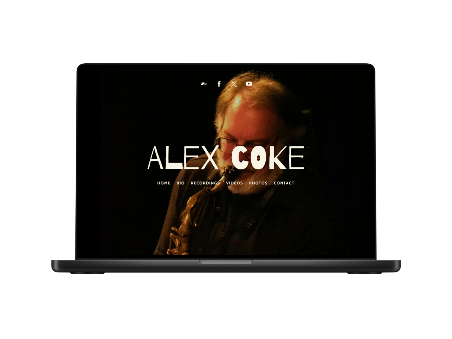
Pretty 2004, right? I can say that because I designed it in 2004. Check out the new design below
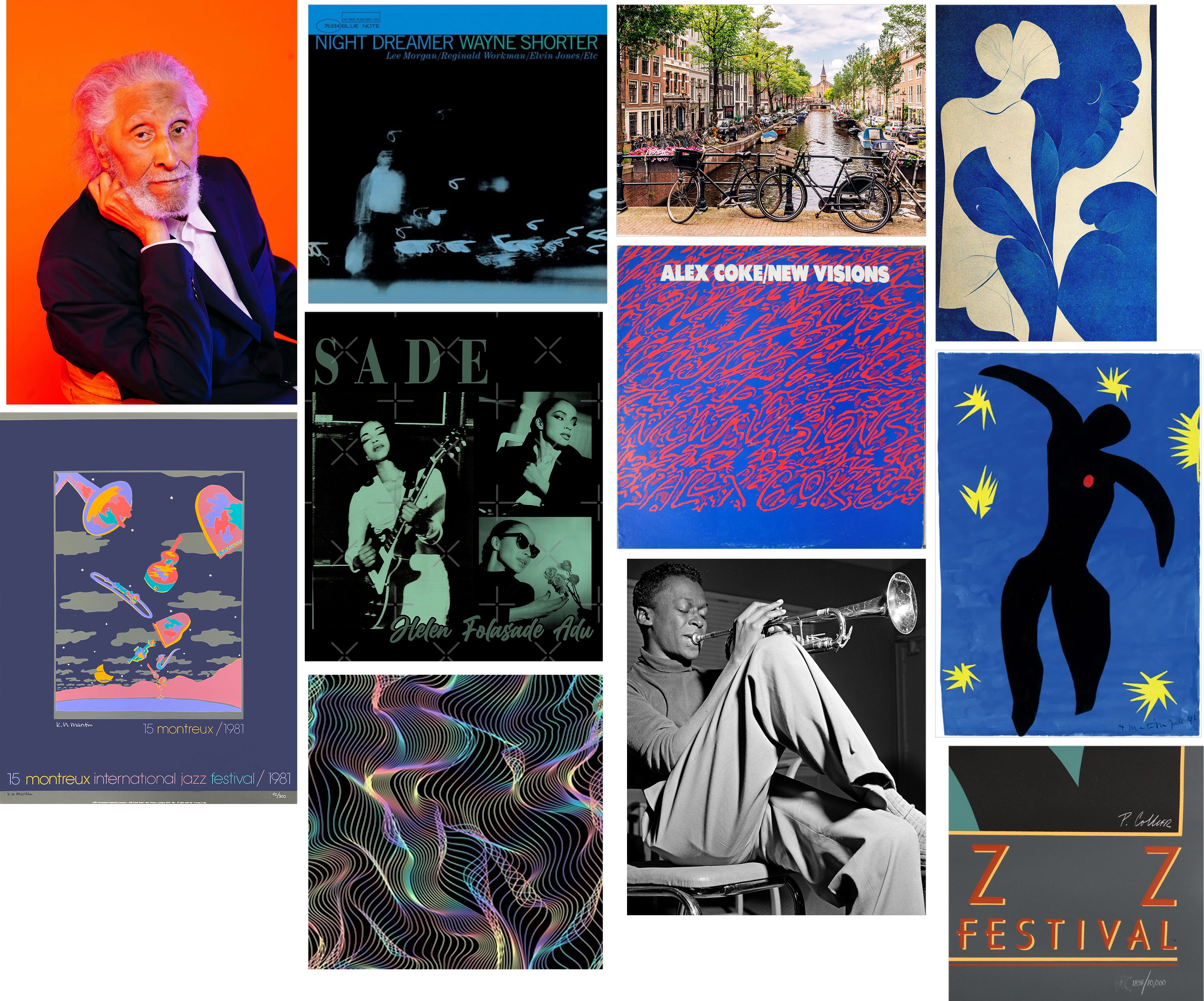
Mood Board
After reviewing the old site, I had a million ideas for what I wanted to do. I needed to organize my thoughts. So I made a mood board which had colors and overall vibe concepts.
Rebrand
While the Mood Board helped with initial conceptual elements for the overall feel of the site, in order to show old and new fans the client’s vitality and importance as an artist, he needed a rebrand. The concept for the rebrand has three areas of focus:

Legacy
More focus on the client’s rich history and importance in the jazz and music world in general

Promotion
Easy and quick ways for fans to purchase current and back catalog albums

Fan Engagement
Videos, Social Media, Contact page, etc. and anything that encourages interacting with fans
New Design

Color Pallete
After reviewing other jazz musicians’ websites, I decided to keep it the colors simple and classic. So I went with navy for the background, a creamy off white for the font, and a black highlight. This also made sure that the album cover, photos and videos would pop across the entire site.
I also added a logo for the site that is very simple and classic. Since the client’s art is very free form, I chose the font “Barrio”, which has a handcrafted, imperfect look and chose to just use the artist’s unadorned name instead of a more stylized design.

Logo

Typography
To achieve maximum readability, I chose the sans-serif font “Cabin.” A font this streamlined also improves overall accessibility for all users, whether they be on desktop or mobile.
Visual Hierarchy

Lines
Buttons
Animation
Social Media
Videos
SEO
Most crucially, I added the fundamental design and navigational elements listed above. While the visual hierarchy, lines, and buttons help users navigate the listed information and the site itself much easier, small animations give the site a more lively and joyous feel.
And since he was still using the original site from 2004 (with very minor informational updates over the years), I also needed to add his social media and his many Youtube videos of live performances. Lastly, in order to help fans more easily find the new site, I added SEO alt text to the most recent albums and to other prominent page elements.
Client Feedback
The client was very happy with the new site overall. However, he did request three important additions, which were:
-
I added all of the albums I could find, but the client wanted ALL albums he had played on to be added
-
The client wanted to add a prominent button or section with an Electronic Press Kit, which is a one stop resource for press and booking agents
-
The client requested a Bandcamp page be created that can be linked to from the Discography page for streamlined album purchasing

One of the client’s early albums
Final Design
Homepage
The client did not want an endless scroll of information on the homepage, so I simply featured the main sections of the site with links to the full pages. He also wanted his email signup list prominently featured, which I did near the top of the page.
Rebrand Focus
Legacy, Promotion, Fan Engagement
Bio
This section focuses on the Legacy part of the rebrand. I wanted the client’s bio to be prominently featured because the length and breadth of his experience is so unique. I also feature some interviews to get an even fuller picture of his life as an artist.
Rebrand Focus
Legacy
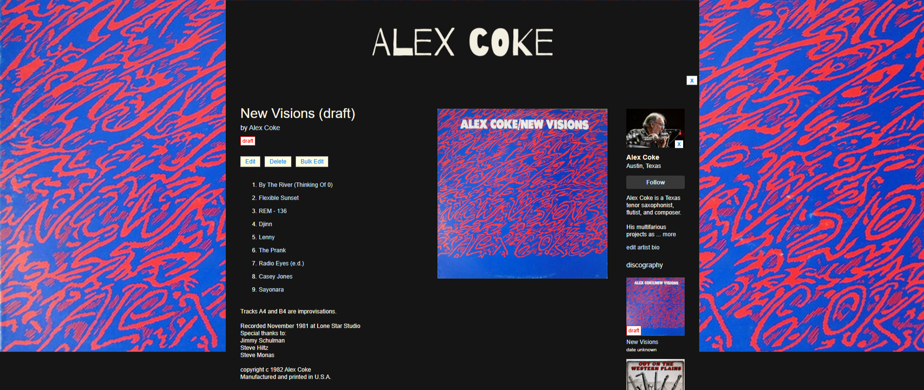
Recordings
Afer getting a full list of recordings from the client I individually added every album he has played on, while featuring those for which he recieves mechanical royalties at the top. As per client request, I only added “Buy Now” options for these featured albums.
Rebrand Focus
Legacy, Promotion, Fan Engagement
Videos
The Videos page features the many live performances the client currently has on YouTube, divided by project. All videos are embedded within the page for easy playability, thereby eliminating the need for a user to open new pages or tabs.
Rebrand Focus
Fan Engagement
Photos
After reading the client’s bio, I realized that he had been in the industry for exactly 50 years! The Photos page is therefore a celebration of that achievement with old and newer photos of the client performing, recording, and posing for artist profiles.
Rebrand Focus
Legacy, Fan Engagement
Contact
The Contact page is a simple way for fans and booking agents to contact the client for inquiries and performances. I placed the Electronic Press Kit download button here as per the client request.
Rebrand Focus
Legacy, Promotion
For the Bandcamp page, I kept the logo and basic color scheme from the website, but added a retro background from the client’s first album to give it a unique look. See the full bandcamp page here:
Impact
The client was extremely happy with the design and functionality of his new site. He also responded very positively to the Photos section celebrating his “50 Years in Music.”
Overall, we were able to increase his click rate by 90%, his fan growth by 100%, and his SEO presence by 89%.
Thank you for checking out this project.
DJ YASHO
Next Case Study
